Strategic Plan Website
UX/UI/Visual Design, Data Visualization
The Town of Nantucket wanted a dashboard in order to communicate the municipality's strategic initiatives and the progress that they were making toward those initiatives to the general public.
As I listened their goals for the dashboard, I realized that a typical dashboard would not serve them well - they needed space to explain their charts, goals, and challenges, because community members would need more context than a dashboard layout would provide. They also needed to be able to guide residents and tell a clear story (i.e. how they were progressing in hitting goals) rather than expecting users to wade through information without any direction.
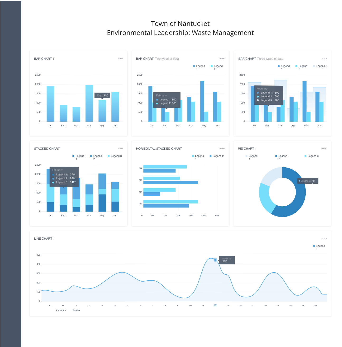
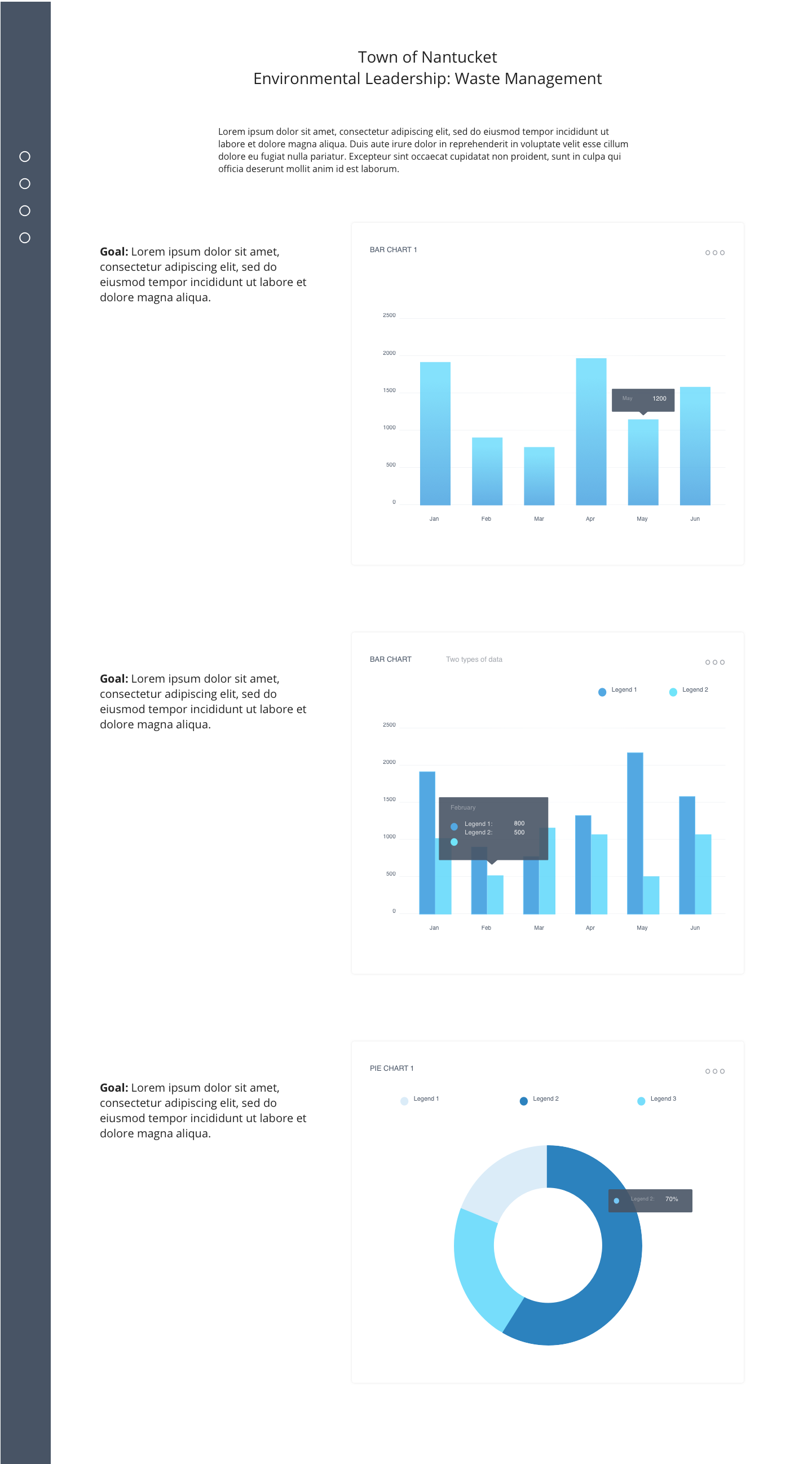
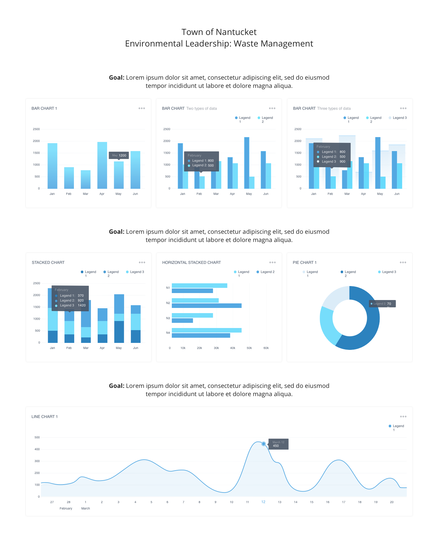
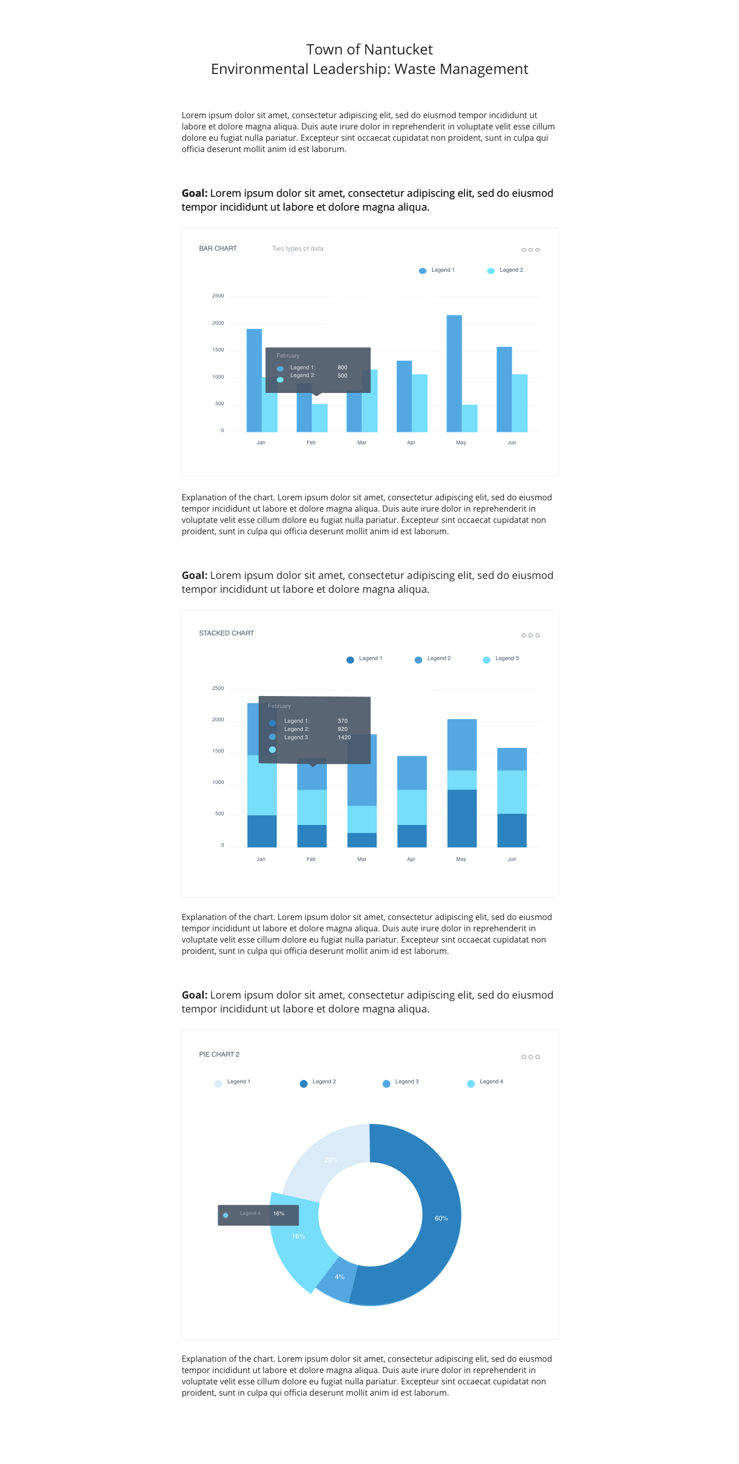
To that end, I presented 4 layout options: 2 dashboards and 2 featured chart layouts.
Wireframes: Layout Options


A Pivot
After walking through the various layout options, stakeholders agreed that a design emphasizing the charts but giving context and narrative to the data was a better solution than what they initially thought they wanted.
The final design had two versions: One layout with full-width charts, which I used for Water Quality because we needed to represent so many neighborhoods along the x-axis, and one layout with 60% width charts, which I used for Waste Management where the charts were easier to read when they were less wide.
Most of the charts were interactive, allowing users to see numbers in greater detail or highlight areas of a map.