Before: A Confusing Interface
The Town of Nantucket needed to be able to prepare for economic downturns before they were in the middle of feeling its effects; they wanted a way to view a set of local and national economic indicators in order to attempt to do economic forecasting. As their economy felt national-level effects on a lag, it would give them time to prepare for the downturn.
Nantucket financial staff had created a tool internally for this purpose, but it was clunky and unintuitive - there was a lot of information and text, and it was difficult for users to know where to focus. It was also difficult to compare the current year to long-term trends or see other metrics in greater detail.
Before: Old, cluttered interface.
After: A Clean, User-Friendly Interface
Interaction Design, Data Visualization, Visual Design
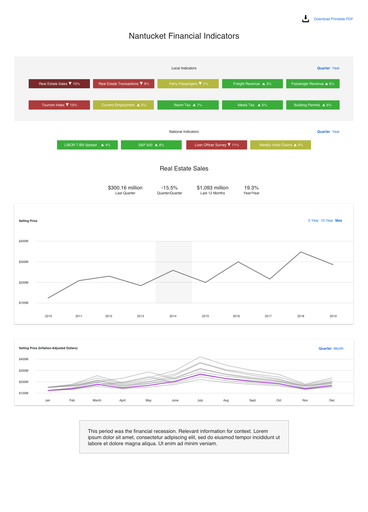
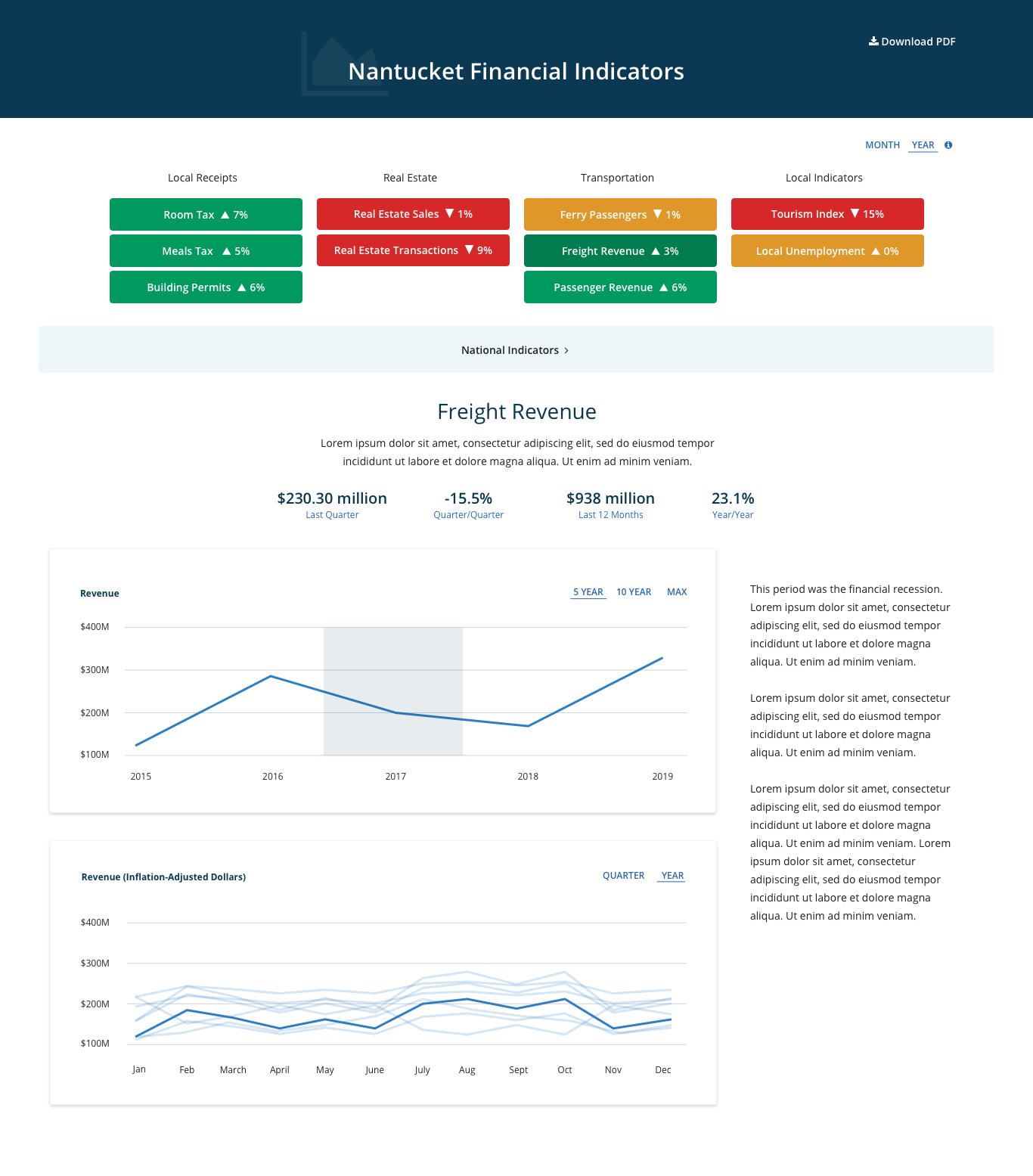
We broke up the dashboard into two charts: A top chart with a brush box allowed users to hover over a specific time period, and on click, the bottom chart allowed users to see the time period selected in the brush box (say, a year) compared to other years, adjusted for inflation.
I then reorganized information so that buttons on the top give a quick visual cue as to which way the indicators are trending. When clicked, each button revealed charts and information about that specific metric.
For each indicator, I added highlighted metrics (that in most cases would show above the fold) so users could get overall detail at a glance.
A year/month toggle allowed users to choose the time segment they wanted to view and affected the coloring of the button indicators.
A 5 Year/10 Year/Max toggle allowed users to choose the period of time they wanted to view on the top chart.
I also added a number of spots that were clickable for users to get more information if they needed to understand information sources, see definitions of terms, and look for any additional points of clarification. It was expandable so that future iterations would have places to add text if needed without adding to visual clutter.
Wireframes


Visual Design
With a few sets of feedback and iterations, I grouped the local indicators into categories with headers to make skimming easier and hid the national indicators inside a toggle to reduce visual clutter, as users said they were less important to see immediately.
The end result was a tool that made a slew of complicated information easier to process. That Nantucket was attempting to do economic forecasting impressed Moody’s and positively affected the town's credit rating.


