Student Preferences
UX/UI/Visual Design, Front-End Code, Copy/UX Writing
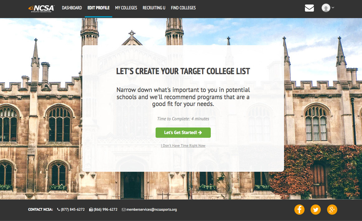
We wanted to help high school student athletes find good fit colleges, but to do so, we needed to understand their preferences, and ideally understand their preferences as they changed (as would happen when a student worked with us over the course of a few years). The existing system overwhelmed students with long forms and lists of questions - students found the process onerous.
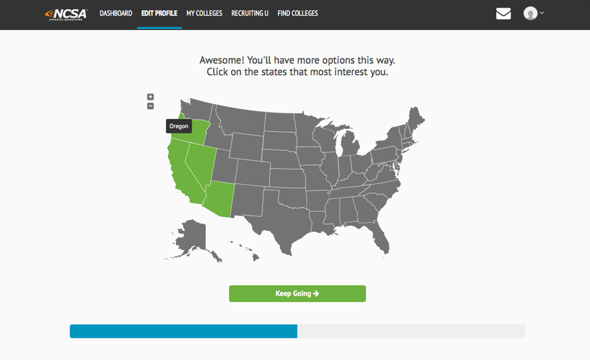
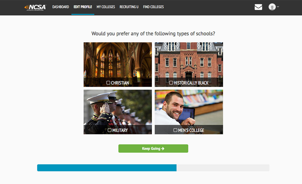
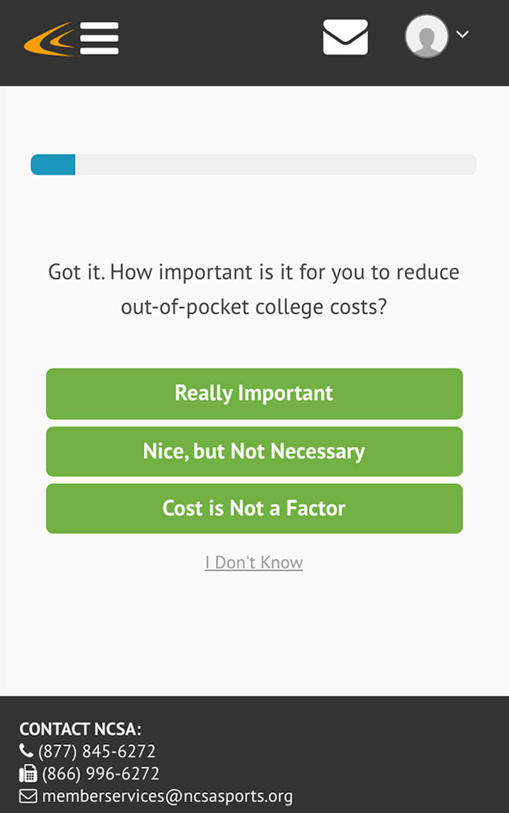
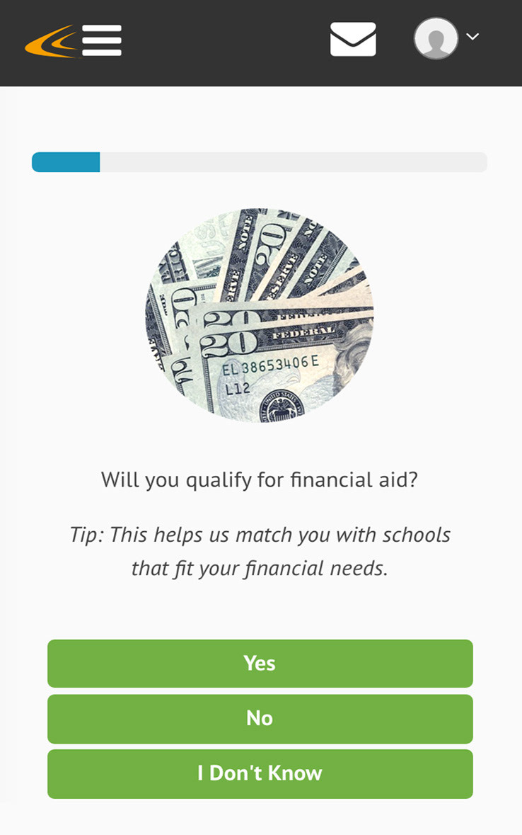
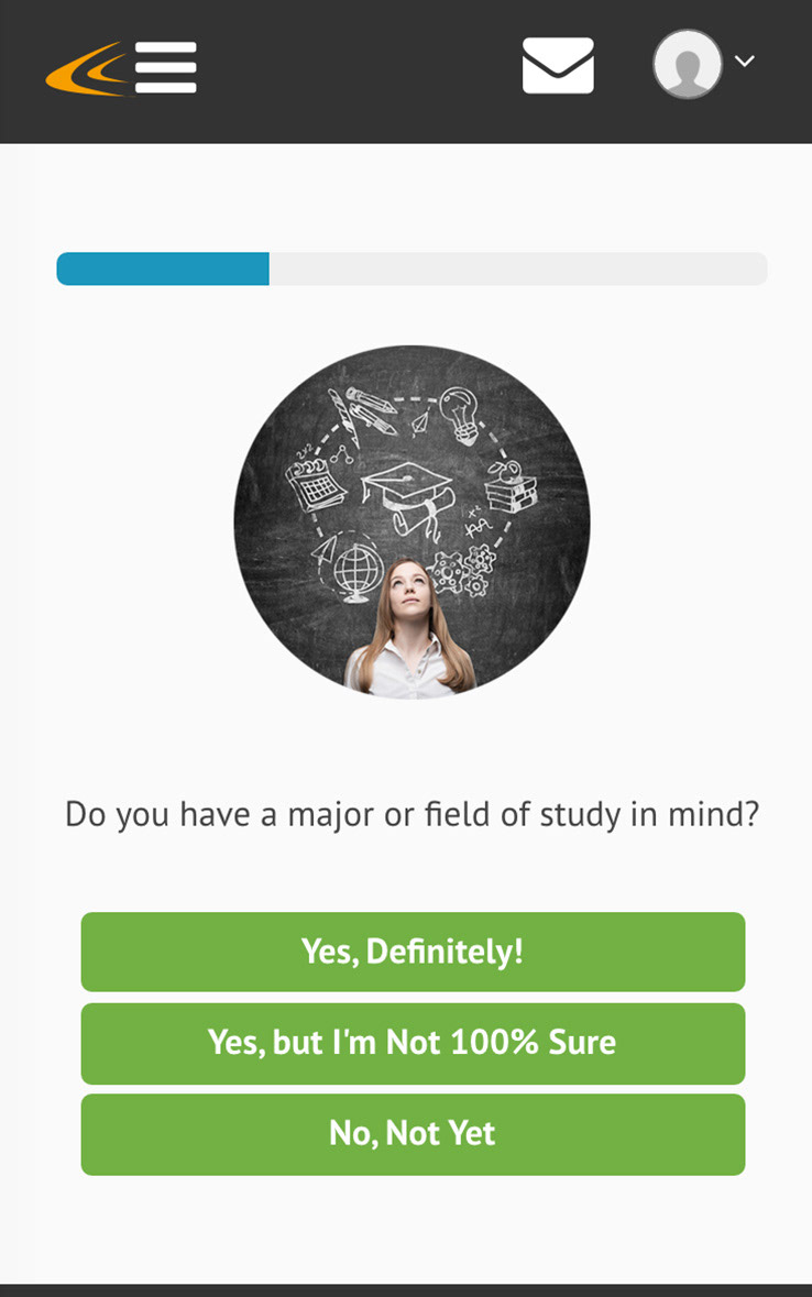
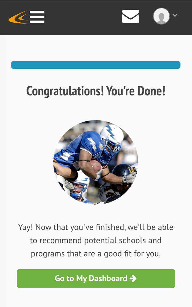
The solution was change the format. Instead of long forms, students went through a set of 13-15 screens (depending on their answers) that only required a single, quick response. The result felt more like a game or a fun, Buzzfeed-style quiz, and a progress bar showed them how far along they were in the process. Users usually got through the preferences screens within 5-10 minutes.
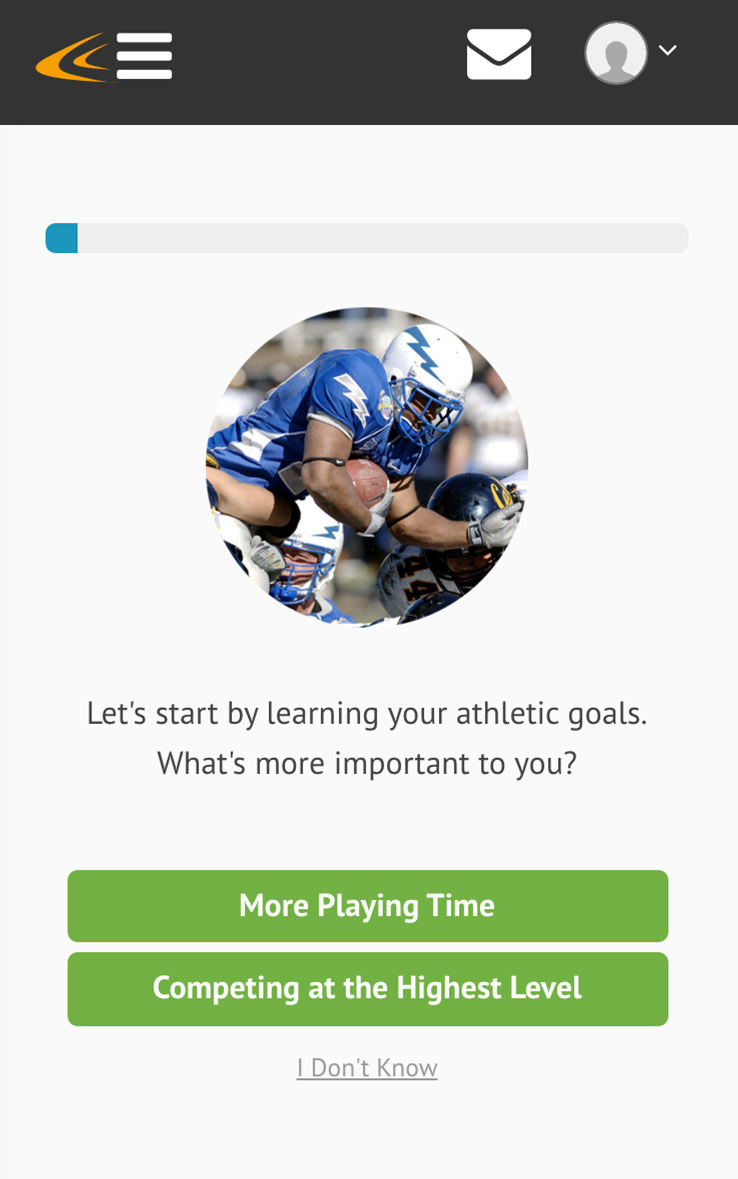
I intentionally designed the mobile version to feel similar to a native app even though each screen was a separate page on a website. This was all fully responsive, flowing smoothly from various desktop screen sizes to tablets to mobile devices.
Mobile Screenshots




Desktop Screenshots
