Before: An Outdated Interface
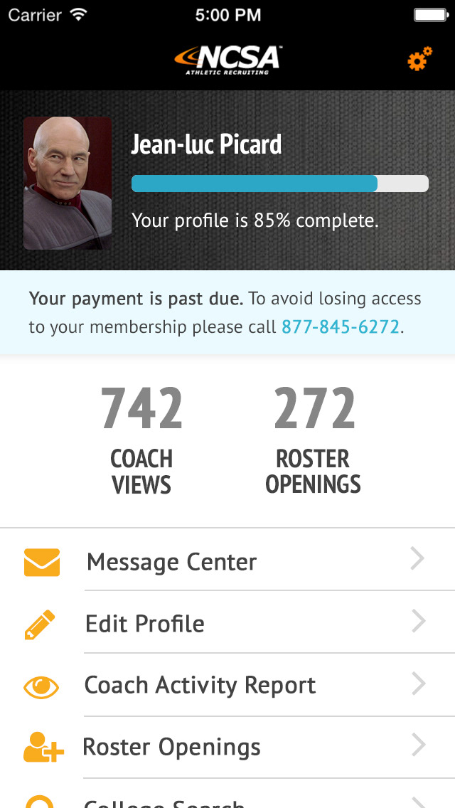
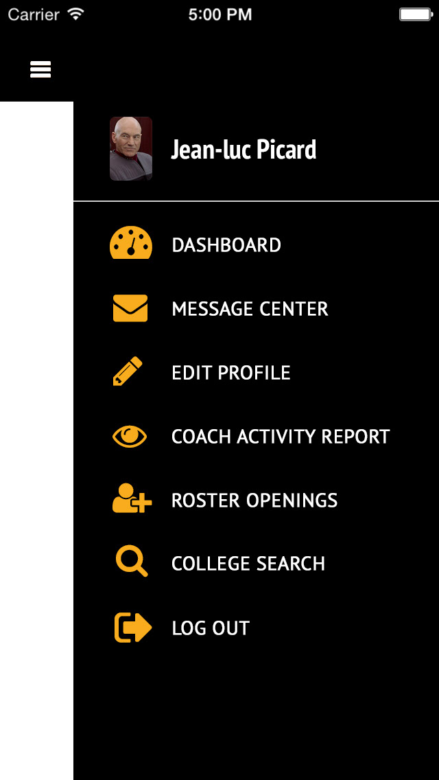
NCSA's iOS app hadn't been updated in a number of years and no longer matched current brand standards. It also looked stylistically dated, which wasn't appropriate for an audience of high school-aged teenagers.
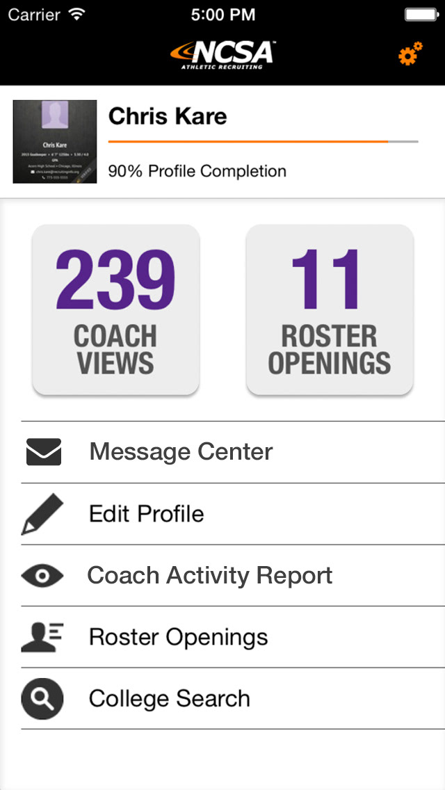
Old app dashboard.
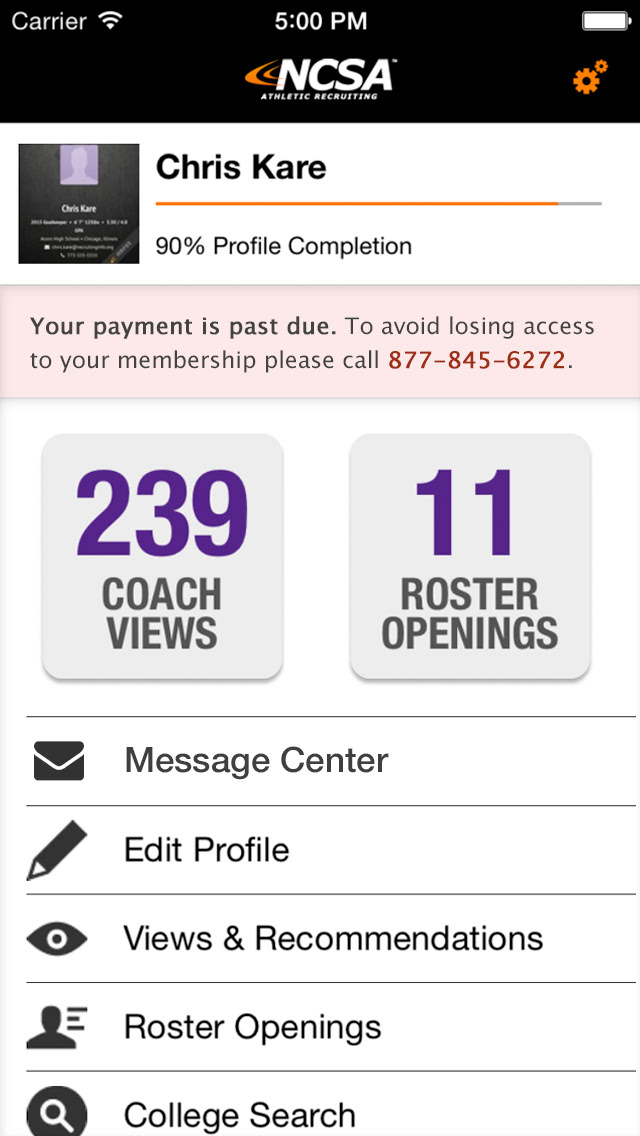
Old app dashboard with flash message.
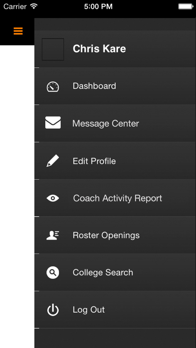
Old app menu.
After: Phase 1 Redesign
UI Design
By the time the dated iOS app was ready to be addressed, NCSA knew another rebranding was coming in the next year. Thus the product manager and I agreed on a two-part redesign: For the Phase 1 app redesign, I left all of the existing elements in place, but gave everything a facelift.
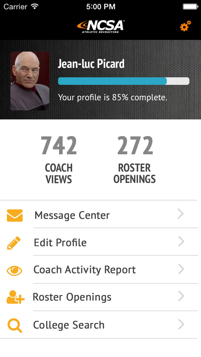
After: Final Redesign
UX/UI/Visual Design
With new branding as a company, it was time to redesign the app from the ground up. We'd changed how the website functioned, moving from an experience that didn't give users any direction to one that guided users step by step. With the new timeline layout, student athletes were guided by the app to complete milestones that would help them understand the college athletic recruiting process and complete task items at the appropriate stage in their recruiting journey.
For the iOS app, I moved away from throwing a list of menu items at the user and instead emphasized a timeline to match our web application. I also exposed as much as possible from the outset with a sticky bottom menu that emphasized the pages that users were most likely to need on a regular basis.
The result was an iOS app with better reviews and higher user engagement, and users who understood what actions they were supposed to take next.