Digital Sales
User Flow, Wireframes, UI Design, Front-End Code
NCSA's standard sales process involved recruiting high school student athletes and having families talk with scouts for around an hour over the phone. If there was a good fit, NCSA would enable them to purchase a package of coaching tools to aid their college athletic recruiting process.
My task was to create a sales process that families could go through on their own.
Before: An Online Sales Process that Relied on Individual Phone Sales Calls
Old sales process that required human, phone interaction for every sale.
After: A Friendly Digital Sales Process with Guidance
First, users were asked to choose whether they would like the system to help them find a coaching package that best fit their needs or would rather explore on their own.
This guided process asked questions that would allow the system to make recommendations for tools that their family would actually use.
Users who opted for guidance received a highlighted recommendation.
All users saw an explanation of the three coaching packages; if users didn't take the guided option, they were visually recommended to take our mid-priced option as good sales practice.
The side-by-side comparison allowed users to easily see what each package contained and how much it would cost.
All package features were clickable with toggles and explanations that appeared on the same page.
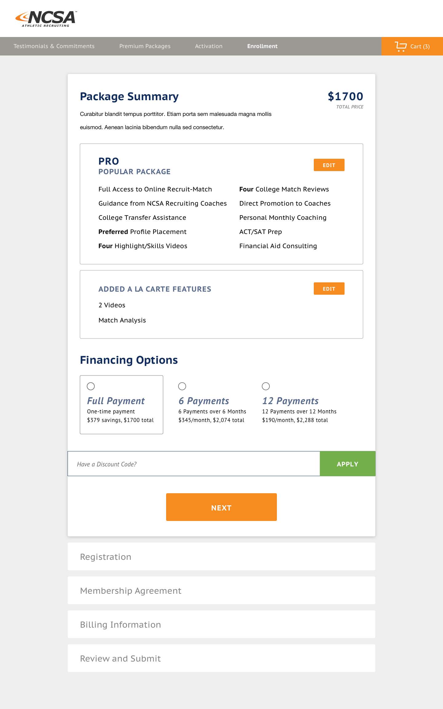
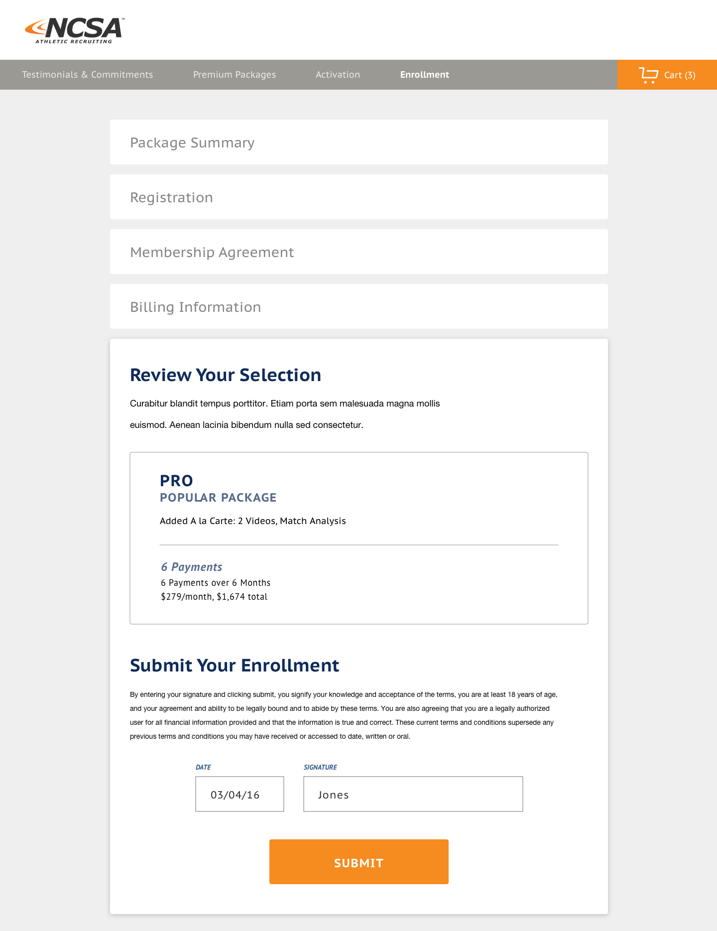
Before: A Long, Multi-Section Checkout Process
The checkout process was arduous; it was a long series of accordions and asked users for more information than necessary.


After: A Vastly Simplified Checkout
I pulled everything out of accordions that so it was all visible from the instant users loaded the checkout page. The Package Summary became a sidebar so users could see it the entire time - this allowed me to eliminate the Review section. Payment options were visually simplified (with Full Payment selected by default), and the Membership Agreement stopped dominating as much visual space.