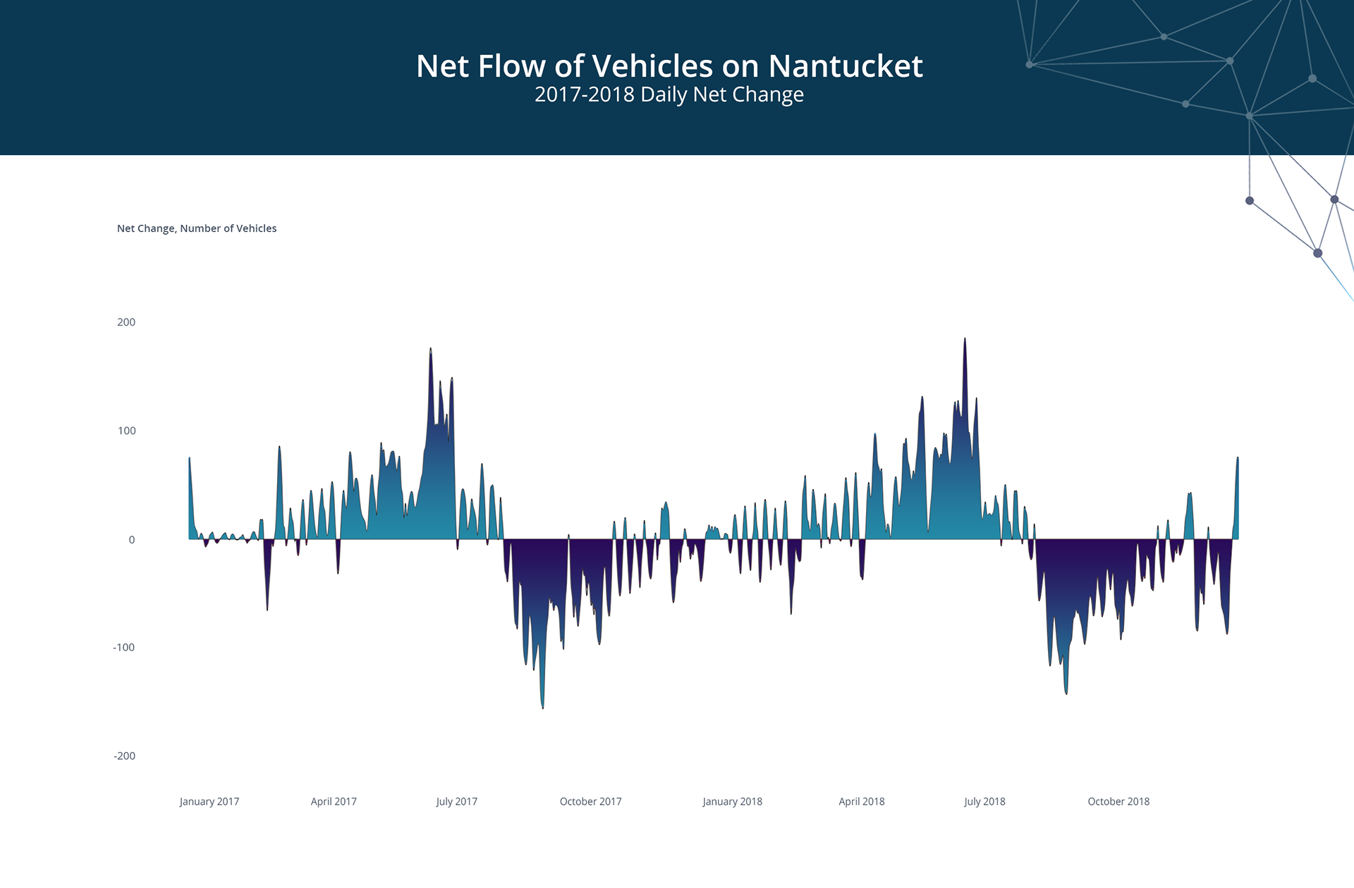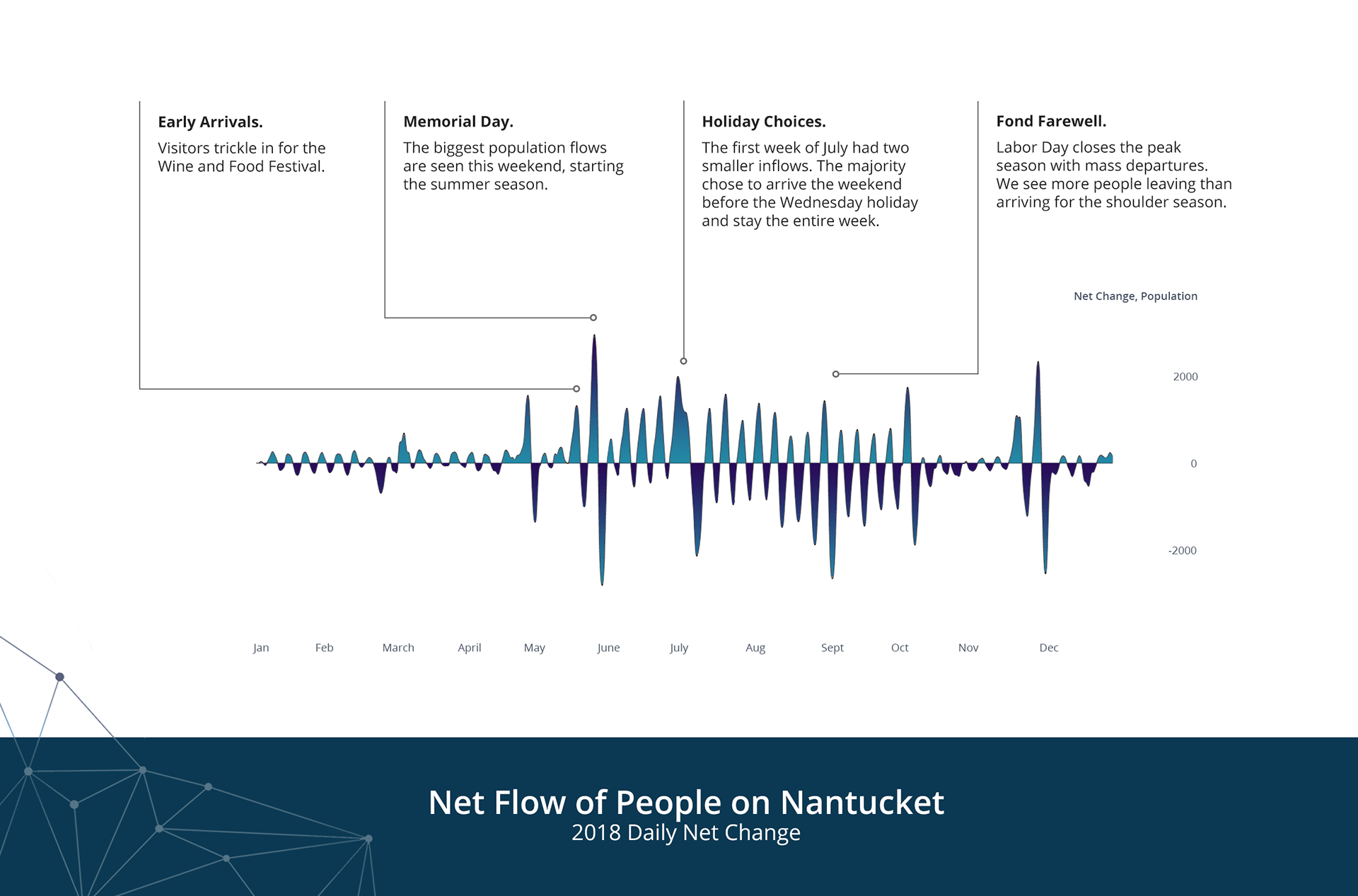
Net Flow Charts
Data Visualization
ReMain Nantucket, an organization committed to the preservation of Nantucket's iconic downtown and a healthy community, needed to understand an overall picture of when visitors and vehicles were coming to and being utilized on the island.
The original charts that they had were confusing; Nantucket life revolves very much around the summer tourist season, but the charts ignored the low season entirely, cutting out a full half of the year. The original visualizations were also presented in the format of a polar chart, which implied consistent, cyclical relationships throughout the year that didn't exist.
These charts, intended primarily for print and presentations, give a broad idea of general ebbs and flows throughout the course of a year and use a chart type that's more suited to the data.